

Entry Hall Design Q+A
For those who love a deep dive

So many of you submitted questions about how I designed this entry hall that I decided to answer them here. The process of researching and dreaming up a design is such a joy, and I hope it inspires you in whatever project you’re working on.
On the Walls
Q: Love that wall floral design! Where’d that come from? :)
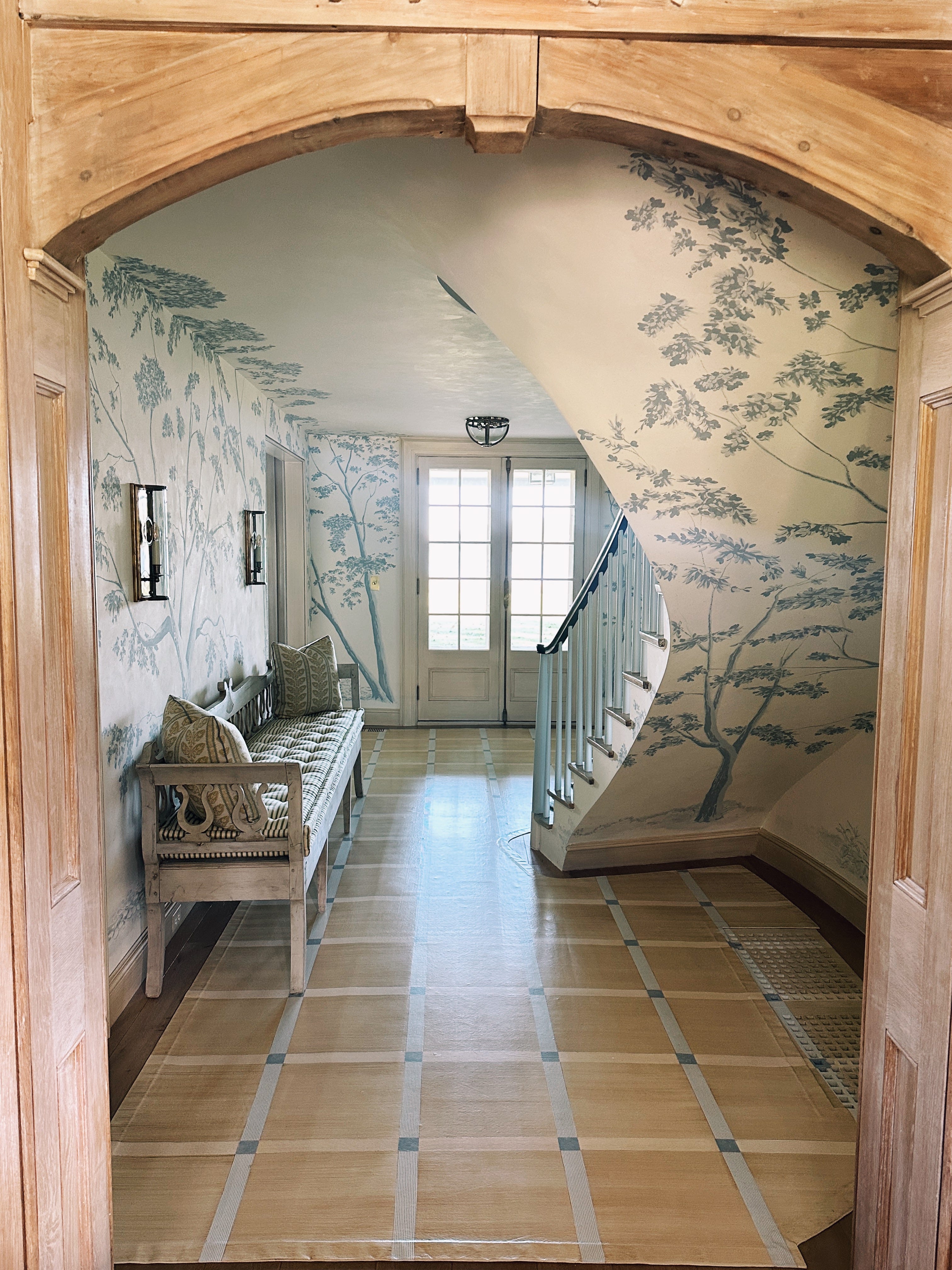
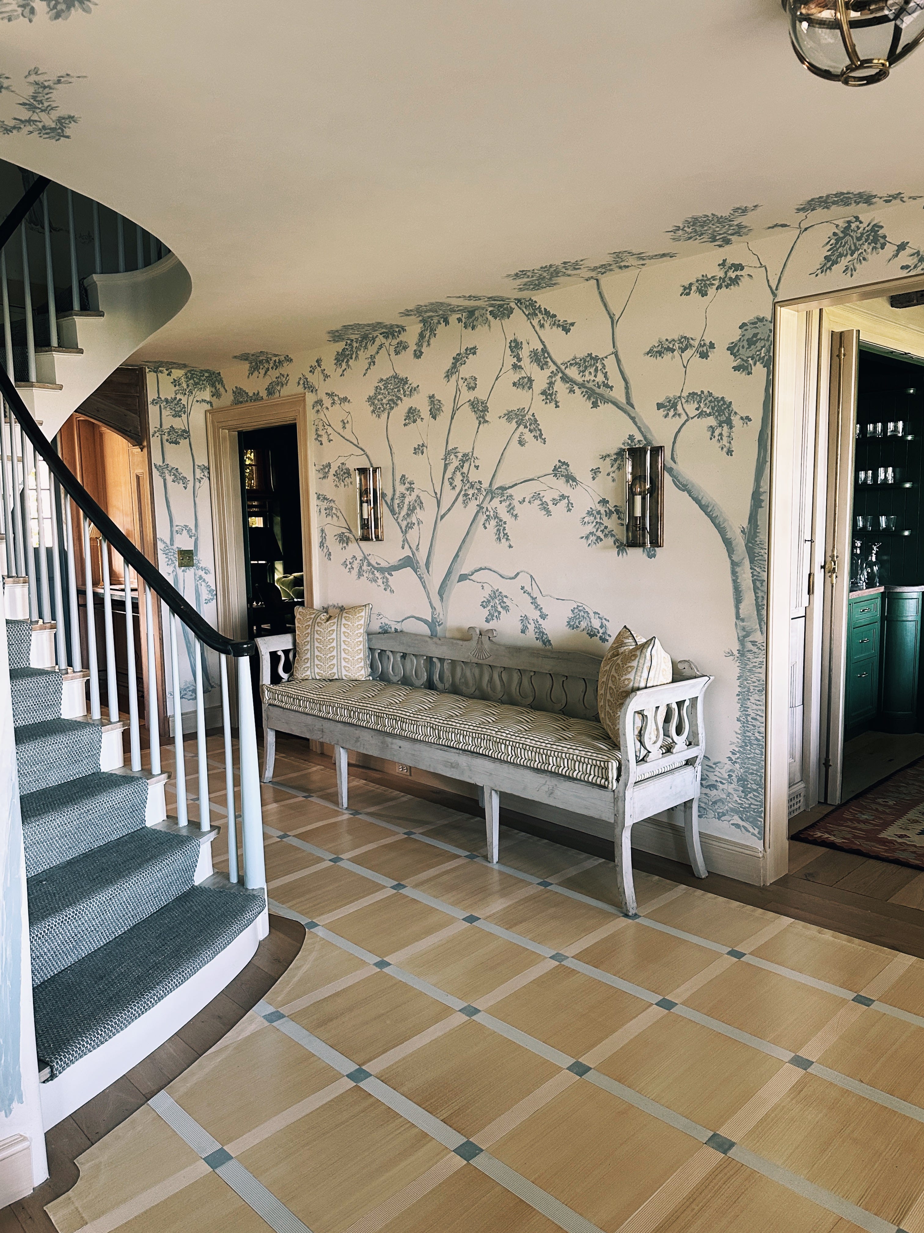
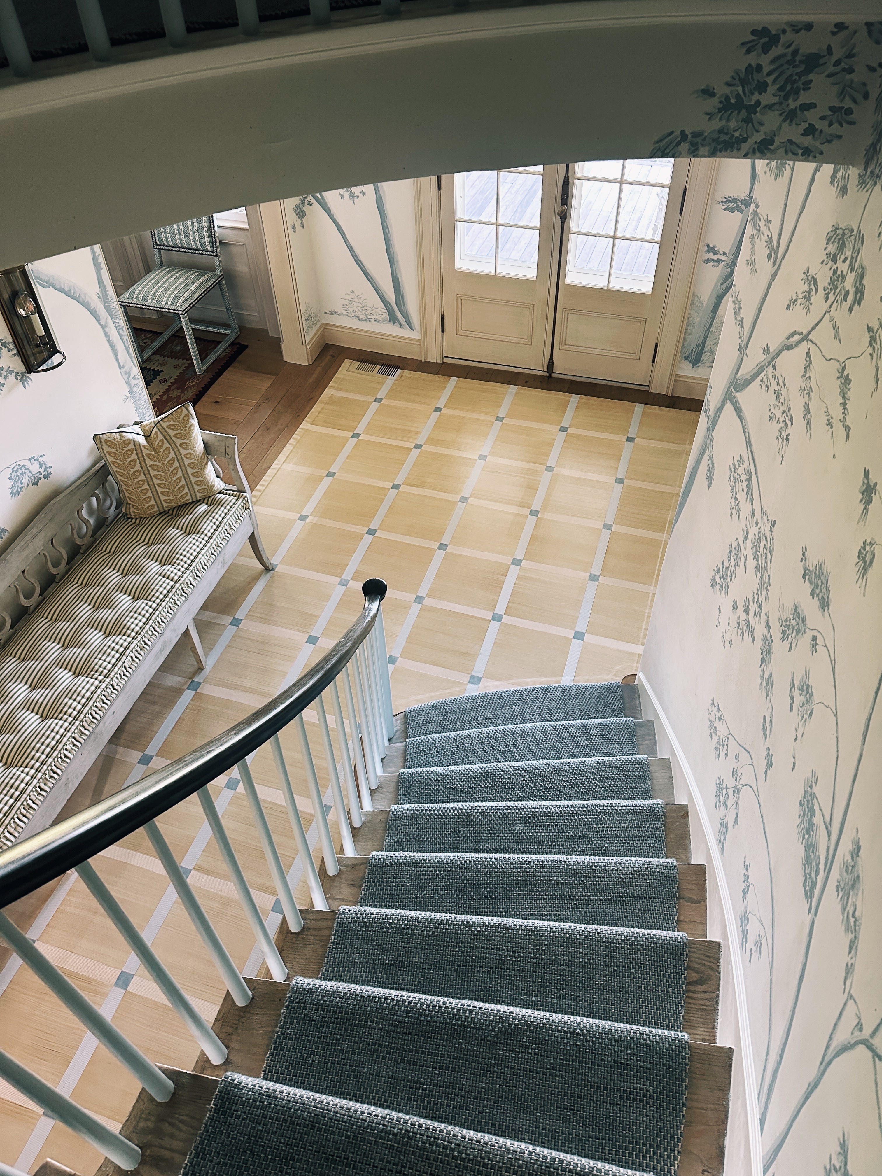
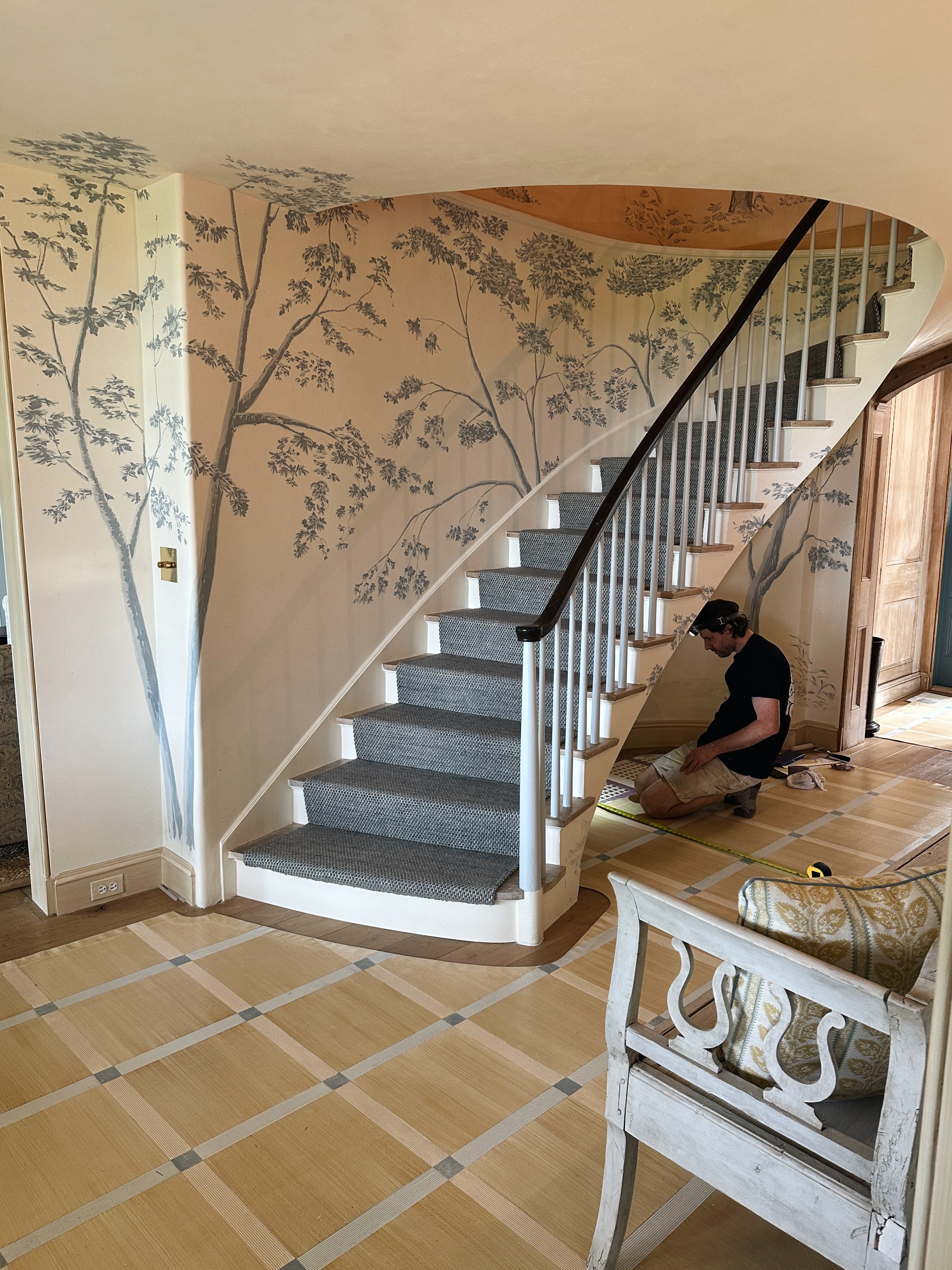
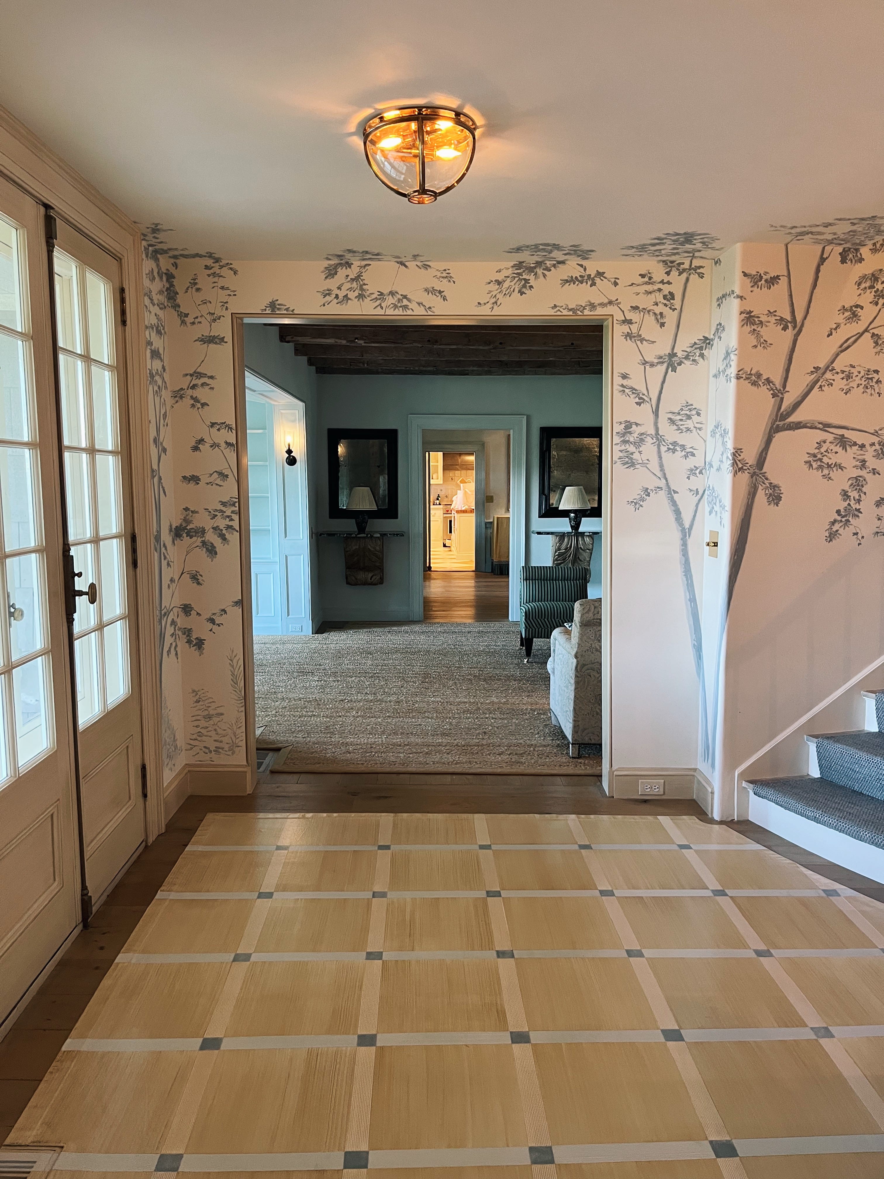
A: This is the entry hall of a historic home built in the mid-1700s, and it has more intimate proportions than the formal rooms of the house. My clients wanted the entry to make a statement while still feeling very inviting. I wanted to trick the eye into believing the space is larger than its actual footprint. One decorative way to achieve this is by using as much white space as possible within a pattern.
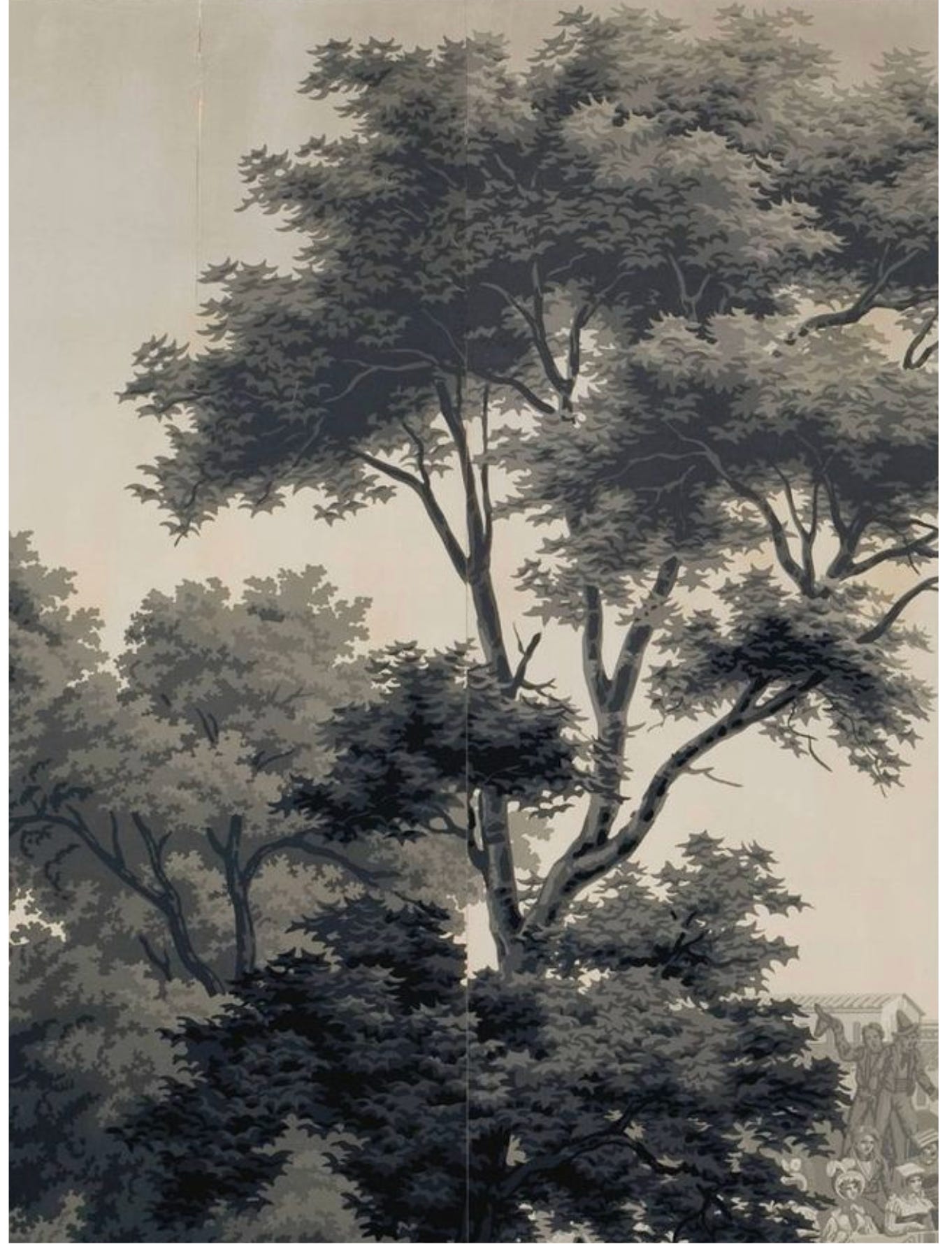
Scenic wallpaper is often the solution when you want to make a statement, and I was drawn to something historic. I stopped by the Pierre Frey showroom to see what Zuber might have that could work for this house. In the showroom, they had framed maquettes of an early 19th-century scenic paper that struck me as the perfect inspiration for a mural. Rather than gray tones, I wanted blues on an ivory background. What I loved about the maquettes was that they felt slightly more naïve than the final product.
Because we wanted the ceilings to feel higher, we removed any additional design elements that would overcomplicate or crowd the space and draw the eye downward. We kept only the trees and painted them onto the ceiling to draw the eye up and make the ceiling feel taller. We also benefited from the fact that this part of the house is so old that there is too much movement in the ceilings for crown molding to sit flat, so we had nothing stopping us from bringing the trees up onto the ceiling.
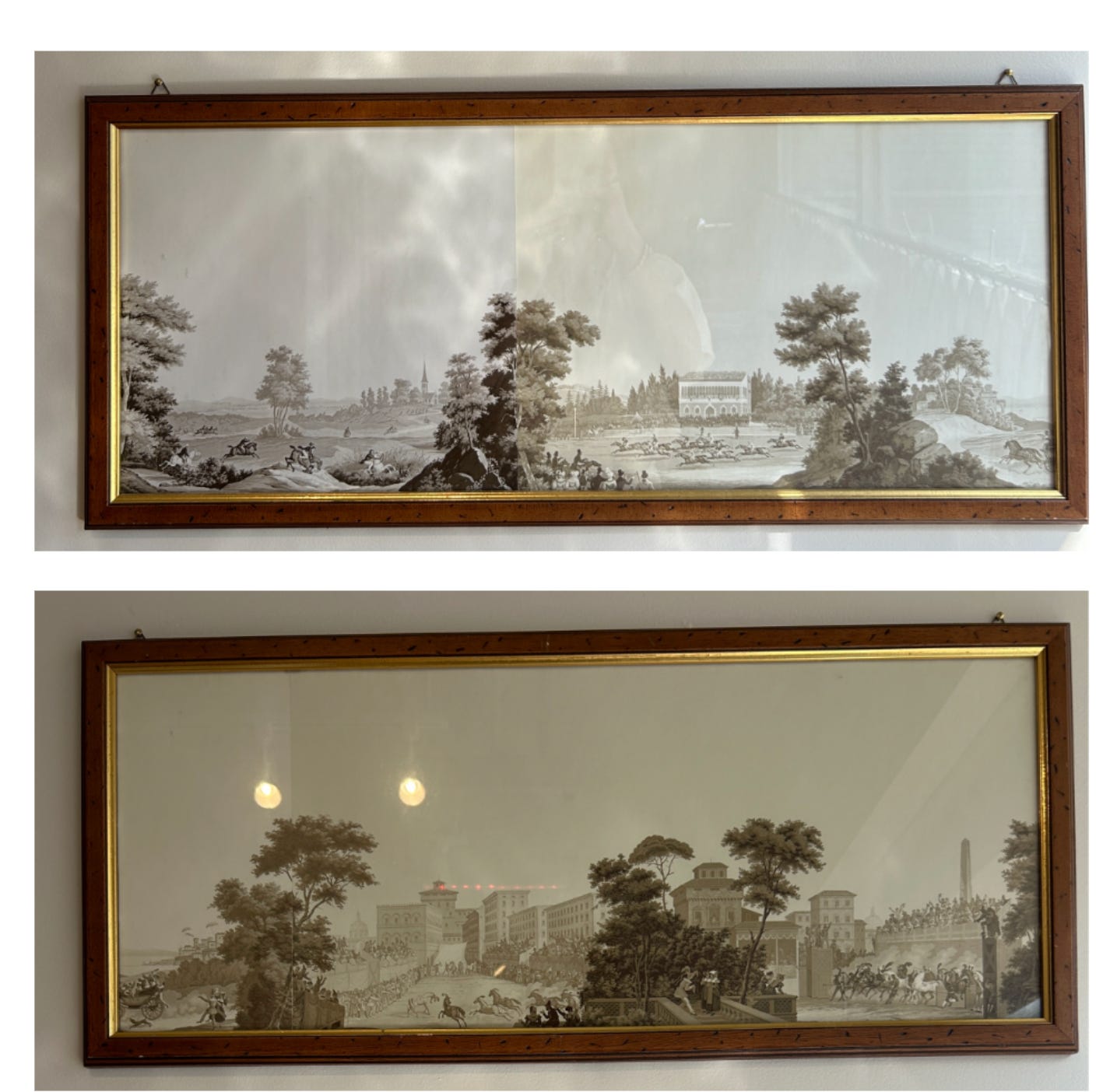
If you’re interested in the history of scenic wallpapers I highly recommend this book.
Q: Or do you give your painter a color scheme + rough concept + they come up with it?
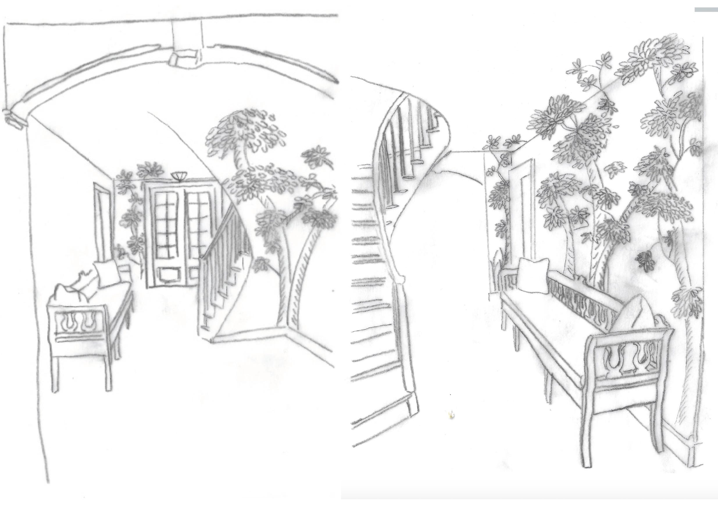
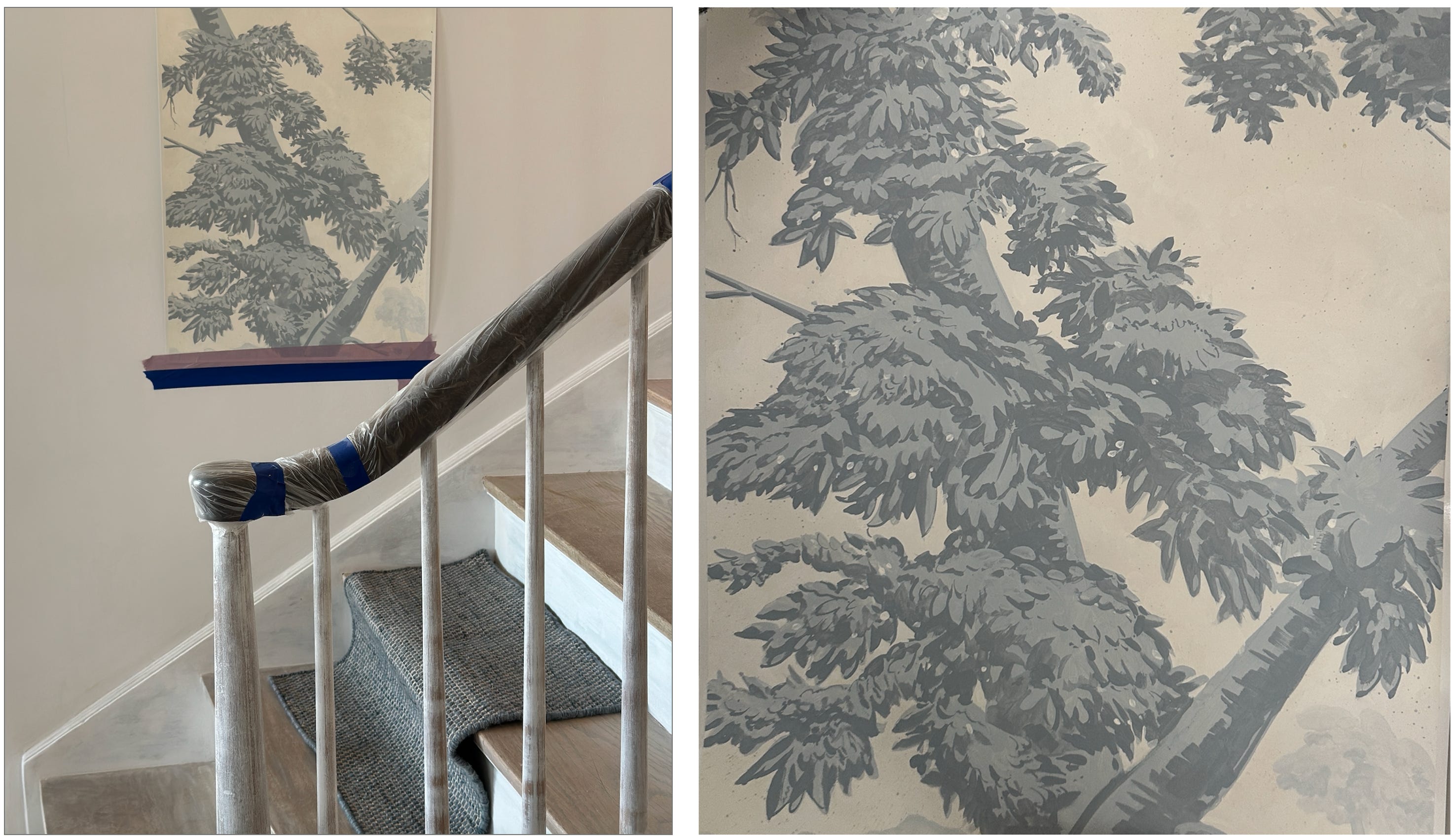
A: This one got cut off, but I think the question is about how specific I am in my instructions for my decorative painters when we are working on a project like this one. I am very specific, but also ask the artist (in this case, Connor Owens of S.O. Beaux Arts) to follow his intuition and give us a sample that he feels confident will communicate the look we’re targeting. Below are images we reviewed, sketches I drew up for this idea, and the sample he made based on our brief. It was perfect.
Custom murals (and custom floor cloths) require months of back and forth between my team and the artists, with tweaks to colors, texture, and maquettes, until we land on the final vision for the space.
I love this video of Connor Owens painting the mural:
On the Floors
Q: Did the walls or the floor come first in your vision?
A: Because I wanted to solve for the space feeling tight, I envisioned these two solutions together. Adding a grid with “white space” (sand strie space in this case!) to the floor expands the space for your eye. A grid in the right scale makes any space feel larger, just as a pattern with white space makes walls retract.
Q: Teach us your ways of finding the perfect balance of warm and cool 🙏
A: This is so personal, but I think when a house is too cool, with no warmer tones, it feels sterile. I always try to find a balance, so thank you for noticing! Here I used a strie on the trim that is a warm, light sand color that is close to the strie color that existed in an adjacent room. We made the oilcloth slightly darker to add contrast and to better hide any dirt that tracks in.
Q: Would love to learn more about floor cloths- design and how they even stay in place!
A: Oilcloths (or floor cloths— either works!) were actually fairly common in early American interiors. They often featured stencil designs or faux marble meant to mimic expensive marbles found in Europe. I love to use them in entries, halls and kitchens because they are waterproof and wipeable. They are essentially painted canvases that are sealed. I sketch the design and scale, provide the paint colors, and our decorative painters interpret the pattern from there. In a space like this one, the cloth is cut to fit the space just like a custom carpet would be. It is kept in place with some adhesive in the corners that is easy to remove and doesn’t harm the floors. The floor grilles, which you can see in the image above, were painted to blend seamlessly with the cloth.
Q: Deciding on carpet vs. painted floor
A: I love a painted floor (or oilcloth) for any space that will be getting a ton of foot traffic and would benefit from a wipeable surface. I also find them easier to customize than carpets because paint colors are easier to manipulate than threads in my opinion. With a painted floor you might need to touch it up every few years, but you wont worry about staining, pilling, or wear on the fibers like you would with a rug.
Q: Where is the carpet on the steps from? How did you select the runner for the staircase?
A: The runner is from Elizabeth Eakins. I wanted something that could withstand a lot of foot traffic, in a tonal version of the blues in the mural. I love a wool basketweave.
Q: Love the painted posts and railing! Do you mind sharing the finishes?
A: Thank you! The spindles are Benjamin Moore Palace Pearl CW660 in a Satin finish. We didn’t touch the existing handrail.
Q: Do you have any consult openings?
A: So nice of you to ask! I’ll add some to the calendar :)

So beautiful! Not quite related, but I was curious if when you source block print fabrics via Etsy you test for lead, or is it assumed that the paint is safe? Thank you!
Wow this is beautiful. Now I want to see the full house/project 😊